Painting Renovation
Professional Painting Services in Kitsilano, Vancouver, BC.
What Are Painting Services
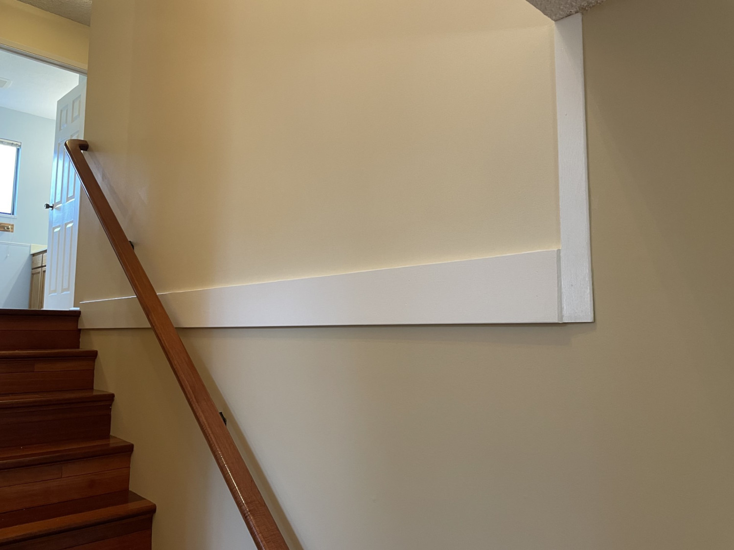
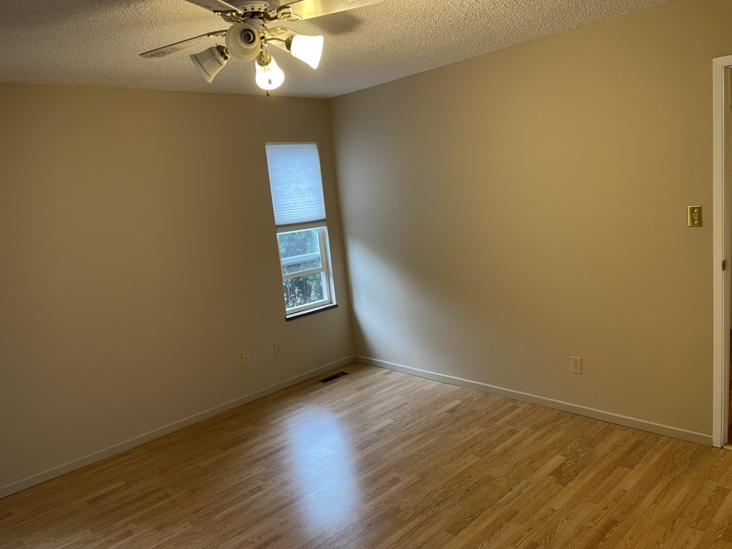
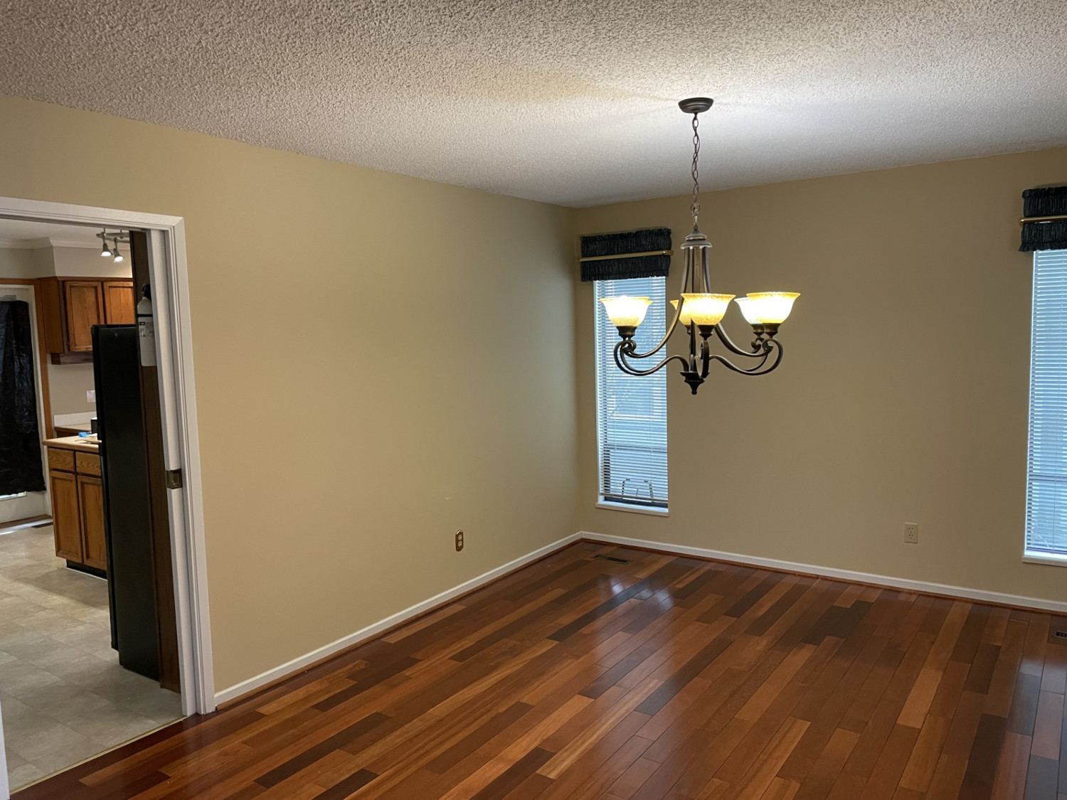
Kitsilano Renovation provides professional interior & exterior painting services. You can have confidence in the quality and value of Kitsilano Renovation painting services.
We provide top-notch painting solutions for all your residential and commercial needs. Our team of skilled and experienced painters are committed to delivering high-quality results that transform your space and exceed your expectations.
From interior and exterior painting to wallpaper installation, our services cover a wide range of surfaces and materials. We use only the best tools and premium paints to ensure a flawless finish that enhances the aesthetic appeal of your property.
Let us bring a fresh coat of color to your space and make your vision a reality. Contact us today to schedule a consultation and receive a free quote.
Painting Services we offer:
Companies that use our services: McDonalds, Remax.
Our Process
We start with the planning for your project.
Then we schedule the best for you time and discuse your project.
We come, do the work, and complete your project.
PROFESIONAL TIPS AND DVICES
How To Choose Interior Paint Colors
1. Create a Color Scheme That Matches Your Home’s Furniture
In a world where thousands of colors can be yours for just $55 a gallon, it pays to consider the advice of architectural color consultant.
“Always remember that while there are thousands of paint chips at the store, there are only seven colors in the paint spectrum,” referring to red, orange, yellow, green, blue, indigo, and violet (what Color Theory 101 students are often taught to remember by the mnemonic device, “Roy G. Biv”). “I always suggest eliminating a couple even before you go to the paint store.”
Here’s her sure-fire 4 step method for creating a color scheme:
- Start by selecting three colors from an existing object in your home. “Take a pillow from the family-room sofa, your favorite tie or scarf, or a painting—anything that conveys comfort or has an emotional connection for you—and take that object to the paint store,” says Krims. “Find three sample strips with those colors, and you instantly have 15 to 18 colors you can use, since each sample strip typically contains six paint colors.”
- The next step is to choose one of the three paint colors as your wall color and to save the other two to be used around the room in fabric or furnishings.
- To choose the colors for adjacent rooms, take the same original three color sample strips and select another color.
- Finally, choose a fourth color that can be used as an accent: “Splash a little of that color into every room of the house—by way of a pillow or plate or artwork. It makes a connection between the spaces” .
2. Decide on the Finish to Create an Appealing Visual Effect
Once you have your colors in hand, consider the finish you’ll be using. Though today’s flat paints have increased stain resistance, conventional wisdom has long held that a satin (also called eggshell) finish is best for walls because it is scrubbable and doesn’t draw attention to imperfections. Semi-gloss and high-gloss finishes, it was thought, were best left to the trim, where they could accent the curves of a molding profile or the panels of a door.
Today, however, finishes are also being used to create visual effects on the entire wall. Paint one wall in a flat or satin finish and the adjacent wall in a semi-gloss, both in the same color, and “when the light hits the walls, it creates a corduroy or velvet effect”. Similarly, you can paint the walls flat and the ceiling semi-gloss to achieve a matte and sheen contrast. (The ceiling will feel higher the more light-reflective it is.) Keep in mind that the higher the gloss, the more sheen and the more attention you draw to the surface. Used strategically, color and gloss together can emphasize your interior’s best assets.
3. Match The Color To The Feeling You Want In The Room
The psychology of color is a minor obsession among paint professionals. Many say you should choose a color based at least in part on how a room is used and the mood you want to establish.
Peter Petrov will suggests, painting social rooms (dining rooms, kitchens, family and living areas) warm colors like daffodil-yellow, coral, or cranberry, and give private rooms (home offices, powder rooms, bedrooms) cooler hues like sage-green, violet, or sky-blue.
Keep in mind, when it comes to emotional effect, of course, one person’s welcome-home orange will be another person’s signal to scram.
And also “red will increase your appetite—and your blood pressure; blues and greens are naturelike and calming; purple is loved by children but not necessarily by adults; yellow is inviting; and orange can be welcoming but also a little irritating, depending on the tint, tone, or shade.”
Research done by Behr indicates that yellow can stimulate the brain, so it might be worth considering for rooms where homework is done, but avoid yellow in bedrooms, where the goal is generally to chill out. Instead, explore these calming colors in the bedroom to help you sleep better.
4. Know Your Whites
Whites come in a staggering variety. Pure, “clean” whites are formulated without tinted undertones. These are favored by designers looking to showcase artwork or furnishings and are often used on ceilings to create a neutral field overhead.
Most other whites are either warm—with yellow, rust, pink, or brownish undertones—or cool, with green, blue, or gray undertones. Peter Petrov will advice you: “Use warmer whites in rooms without a lot of natural light, or to make larger spaces seem cozier.”
Cool whites, by contrast, can help open up a space. Test several at once to see which one works best with the other colors at play in the room.
How To Use Interior Paint Colors
5. Create Flow in Open Plan Spaces
Continuity is important on the ground floor, but color can help “zone” a big open space, separating the dining area from the TV room, for instance. There’s no need to stick to a single color or even a single color palette that is either all warm (reds, oranges, yellows) or all cool (blues, greens, bright whites).
However, “by using muted, dustier values, there’s a better chance the colors you choose will flow into one another,” says Peter. He recommends leaning toward colors softened by a bit of gray, these are often found in historical palettes. Bright colors can be injected in small doses as accents—in furnishings, floor coverings, even flowers.
6. Make Small Spaces Feel Bigger or Cozier
What Colors Make A Room Look Bigger?
Generally, crisp whites can make a space feel bigger and more open, while warm colors create a sense of intimacy. At the most rudimentary level, large rooms generally can handle more color than small rooms. “Lighter hues can open up a small space, while darker colors give the perception that the surfaces are closer than they are” .
What Colors Make A Room Cozier?
Of course, some small spaces don’t need to feel big: If you’re aiming to create a welcoming or cozy atmosphere in a foyer, study, or library, for example, hunter green or rust may serve you better than pale peach or celery.
7. Using Color Architecturally
One of the most effective ways to use color to transform a room is to play up its architectural features. Molding, mantels, built-in bookcases, arched doorways, wainscot, windows, and doors all offer an opportunity to add another layer of interest to colored walls.
Painting Molding and Doorways
For subtle emphasis, painting molding or doorways just one step lighter or darker than the primary wall. “It’s a subtle shift in color but it really brings your eye to the detail”.
Painting a metallic glaze right on top of an existing painted element, like a ceiling medallion, is another way to draw attention. “A copper or bronze finish is very translucent and it gives a nice shimmer that enhances the architectural feature” .
Where Do You Switch Color When Moving From Door to Casing?
It’s not an open-and-shut case, but the rule of thumb goes something like this: Paint the face of the door the color of the trim in the room it faces when shut, and the edges of the door the same color as the trim in the room it swings into.
If you’re using different trim colors in adjoining rooms, they need to work well together. “Doors tend to stay open, so you’ll have the trim color from an adjoining room in any given space on a regular basis”. So, let’s say you have a barn-red door opening into a room with pale yellow walls. “This can be an effective accent color in the space where it doesn’t ‘belong’—if it’s carefully considered.”
Keeping trim color consistent in adjoining rooms that have open entryways generally offers a sense of cohesiveness, providing an unbroken line that is pleasing to the eye. In an open plan, consider painting all the trim white, even where wall colors vary.
8. Exploring Using Two Different Colors in The Same Room
For a bolder approach, try using two different colors in the same room. For example, paint a built-in bookcase or niche a shade of green in a room with blue walls, which will highlight the items on the bookcase or inside the recessed area. Of course, architectural elements can also provide continuity throughout a house if they are painted the same color in every room. Starting in the Federal period and continuing today, white and off-white have been the traditional choice for molding, windows, and doors.
9. Create Contrast in Rooms with Wainscoting
A room containing wainscot provides a good opportunity for a contrast between light and dark. A dark wainscot below a bright wall will draw attention to the upper walls, while a bright white wainscot next to a colored wall will focus the eye on the wainscot. You can also use paint to create the effect of wainscot where it doesn’t exist by covering the bottom third of the wall in one color and the upper walls in another; then place a piece of flat molding along the intersection and paint it the color of the lower wall to reinforce the wainscot look.
10. Create An Accent Wall to Add a Focal Point
Where rooms are relatively featureless, painting an “accent wall” in a vivid hue where the others are white or neutral can add a dramatic, contemporary edge. Peter will advice to paint the primary walls a soft color such as beige or celadon green and the accent wall three shades darker. “The accent wall still gives the room some punch, but it’s not as dramatic.”
11. Explore Bolder Options with Multiple Colors
If drama is your goal, you might rethink the entire notion of painting a wall from corner to corner, and you’ll create an architectural emphasis where one doesn’t exist. Moving around the room in a clockwise direction, try painting a third of one wall and two thirds of the adjacent wall, wrapping the corner in color. Then paint the last one eighth of the second wall and three quarters of its adjacent wall, covering that corner.
12. Treat Your Ceiling Like a Fifth Wall
To give low ceilings the illusion of height, paint them white and any crown molding the same color as the wall, this will keep from interrupting your gaze upward.
Though sticking to “ceiling white” generally makes a space feel airy, a similar effect can be achieved by painting the ceiling a lighter shade of the wall color. Just take the paint sample card that has your wall color as the middle choice, then go one or two choices lighter for the ceiling color. The result will be a room that appears larger, because the contrast between wall color and ceiling color has been softened. In a small room, such as a bathroom, the ceiling can even be painted the same color as the walls to make it look bigger.
5 Paint Color Selection Mistakes To Avoid
1. Being Afraid To Explore Interior Paint Color Options
“The world is divided into two groups—the color courageous and the color cowardly,” says New York color marketing consultant Ken Charbonneau. “People who live in colorful interiors have gotten over the fear of making a mistake.” The best way to get over that fear is to always start with a color you love—from a rug, a painting, a fabric. Then test it on the wall. If it’s too strong, consider asking your paint store to formulate it at “half-strength” to lighten it or to tone it down by adding more gray.
2. Putting Too Much Paint On The Walls
Be aware of the intensity of the colors in a room. “If you have an Oriental rug with five or six strong colors, don’t paint the walls in equally strong hues. Let the rug be the focal point and the walls a lighter color,” says Sherwin-Williams’s Sheri Thompson.
3. Putting Too Little Paint On The Walls
If you think your room is boring, look at it in terms of the 60-30-10 rule that designers employ.
What is the 60 30 10 decorating rule?
Sixty percent of the color in a space generally comes from the walls; 30 percent from upholstery, floor covering, or window treatments; and 10 percent from accent pieces, accessories, and artwork. Translation: Liven up those white walls.
4. Rushing The Paint Selection Process
The best way to find a color you can live with is to paint a 4-by-4-foot swatch on the wall and live with it for at least 24 to 48 hours so you can see it in action.
The size of the room, the amount of natural or artificial light, and competing elements—ranging from flooring to furnishings—can all affect the way a particular color is perceived.
5. Forgetting About Primer
When changing the color of a wall, primer (white or tinted) is vital to getting the actual color you picked out. Michael Baillie, paint sales associate at The Home Depot, says, “Priming ensures there will be no interference from the previous wall color.”
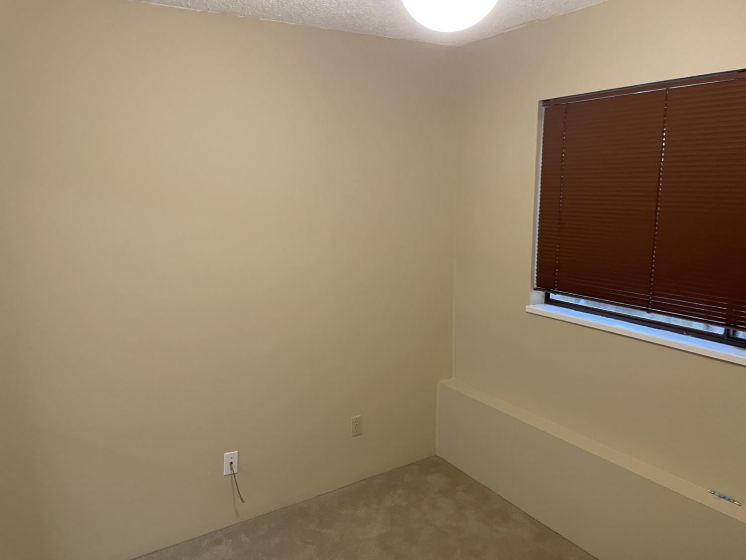
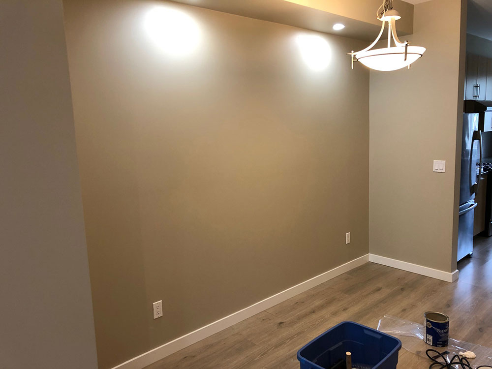
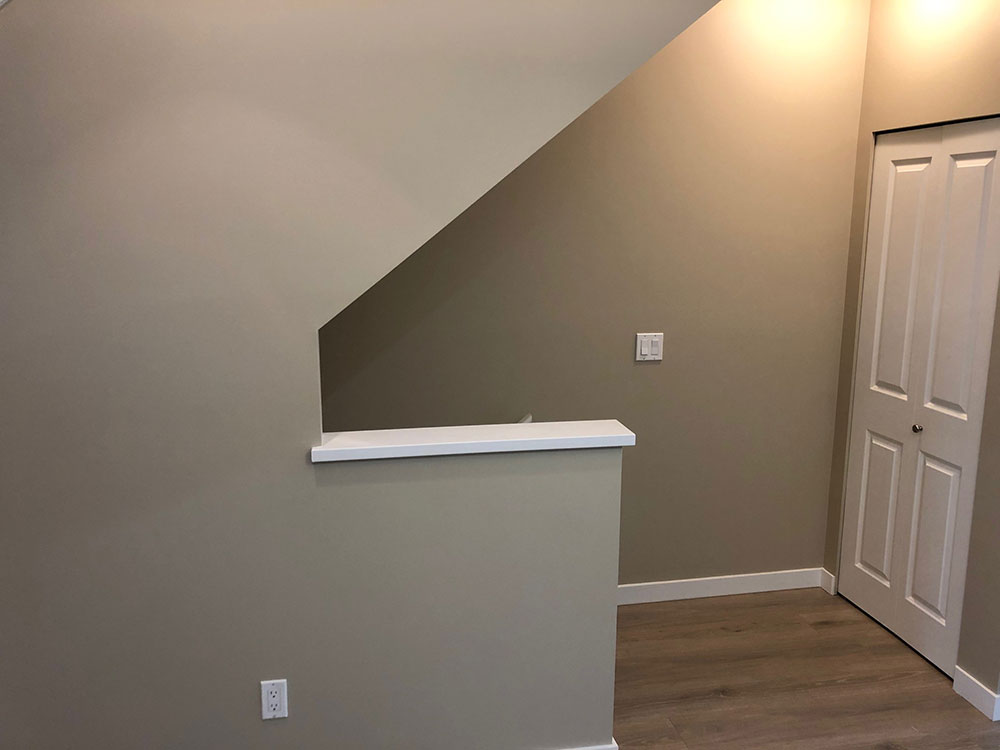
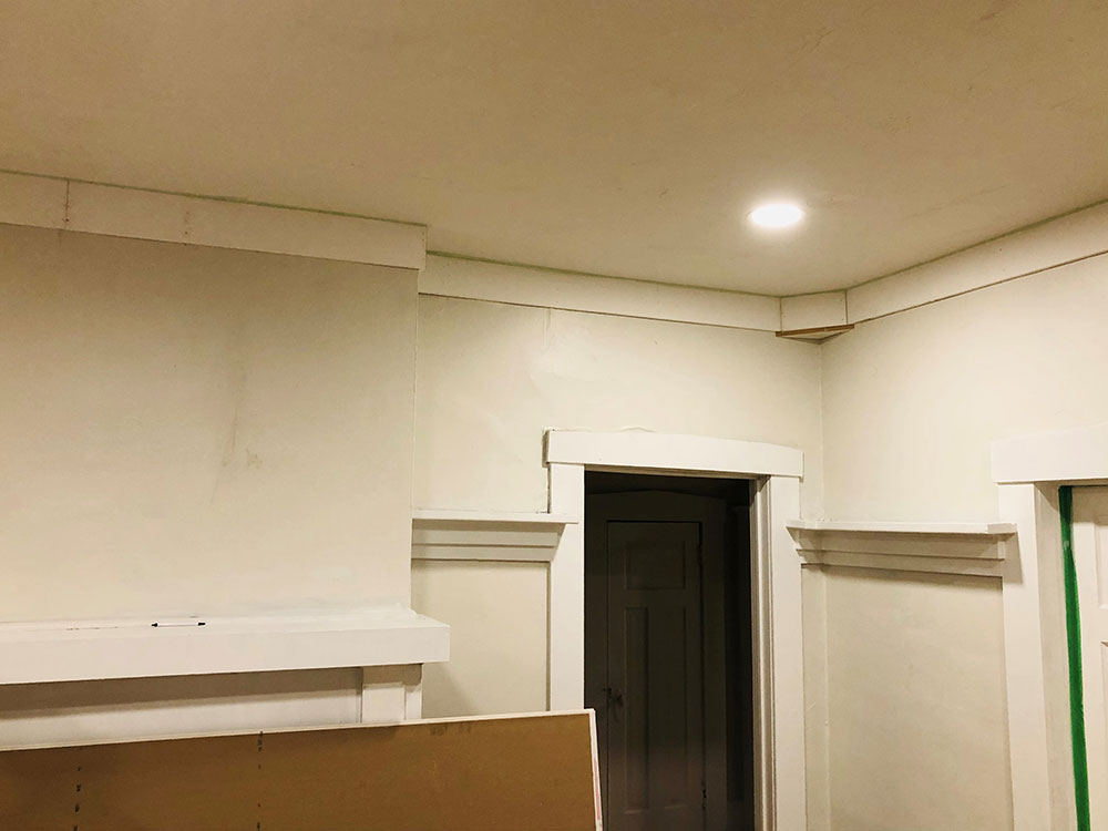
Projects
Flexible Hours
We are available from Monday to Saturday from 7am to 7pm.
Contact us to schedule the best for you time.
Certifications
We are certified professionals for the services we are offering. We have extensive knowledge, training, certifications, & experiences.
Affordable Prices
Your satisfaction is our primary objective, and that is why we provide affordable and competitive price for all our services.
Reliable
We understand that your time is valuable and that no one can afford to waste their time. That’s why we guarantee a reliable & efficient service.
READY TO START YOUR PROJECT?
It Starts Here At Markoni Renovations LTD
Markoni Renovations LTD is a home renovation company providing wide range of services including Handyman services . We provide value-added renovation services throughout your Kitchen Renovations, Bathroom, Basement Suite, Additions, or any other construction projects from planning to completion.
We are available Monday to Saturday from 7am to 7pm.